Our Audit BI dashboard helps you to map your supply chain risks


![]()
At the beginning of March, Chainpoint added a new and exciting module to the TfS Online Audit Sharing IT Solution (OASIS): the Audit Business Intelligence (BI) dashboard.
Available to all company administrators, this tool helps members to visualise their risks, as well as the entire TfS pool of over 600 Audited suppliers.
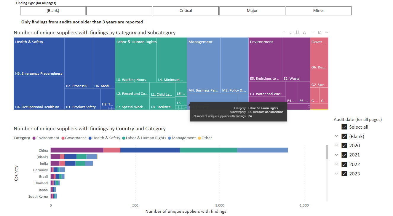
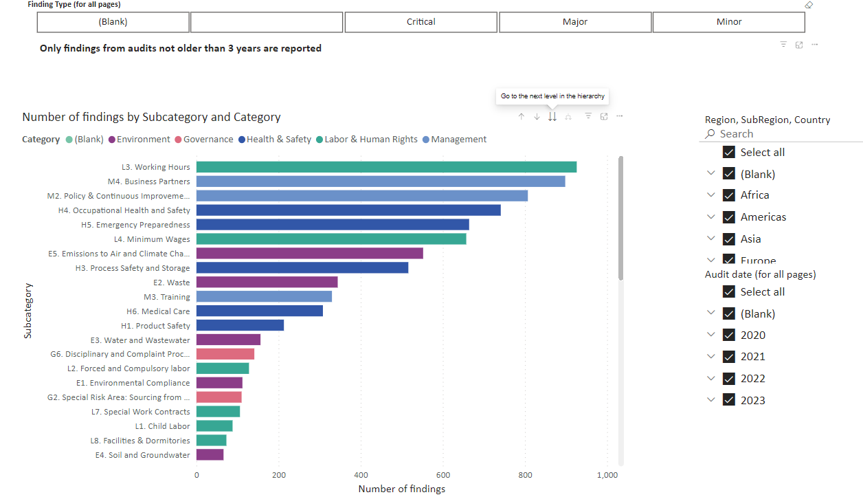
The tool cross-references findings (minor/major/critical) with the Audit chapters, locations and years. Using those variables, members can create five types of visuals:
- A world map showing the concentration of Audits
- A tree map based on the number of suppliers – divided by Audit chapters
- A tree map based on the number of findings – divided by Audit chapters
- A simple bar chart to display the number of findings per chapter
- An overview of all suppliers with their respective number of findings
This dashboard is also a crucial step in making the TfS strategy more tangible, giving the TfS Work Stream 3 (Audits) the ability to analyse the entire pool and identify actionable items. This allows us to link them to the results of the EcoVadis Assessment action dashboard to find overlaps. This will help us define common areas for improvement and ultimately formulate a common approach to address them globally.
Christopher Easton, Work Stream 3 Chair said: “The Audit dashboard is a game-changer. For the first time ever, members can literally see what and where the critical issues are and act on them. In addition, we can now analyse global and regional trends and identify the key areas where we, as TfS, should collectively focus our efforts and engage suppliers.”
Tree map of topic categories by supplier and its division by country
Visual of most common findings appearing in 600+ Audits
Author: Jakob Smets, Audit Manager, Together for Sustainability